
Ever since late 2017, I have (mostly) been wearing my Apple Watch to track activity, heart rate, and sleep. Here I plot some of my heart rate data up, as an initial step toward a deeper analysis.
The Jupyter notebook in which this visualization is made can be found here, although commits after this post may change the most updated version of the code.
Code
First, export health data from your iPhone using the Health app.
Then, import modules:
import pandas as pd
import numpy as np
import matplotlib.pyplot as plt
from datetime import datetime
import re
import csv
from tqdm import tqdm_notebook

import sys
sys.path.append('../')
from functions import *
Read in the resulting data file with the help of some code from https://github.com/minimaxir/get-heart-rate-csv:
# note that this file is not pushed to GitHub
file_name = '20190508_export.xml'

# read in the file, and export to a .csv
pattern = '^.*IdentifierHeartRate".*startDate="(.{19}).*value="([0-9]*).*$'

with open('/Users/yuempark/GitHub/data-projects/sensitive-data/20190508-heart-rate.csv', 'w') as f:
    writer = csv.writer(f)
    writer.writerow(['dt', 'bpm'])

    with open(file_name, 'r') as f2:
        for line in f2:
            search = re.search(pattern, line)
            if search is not None:
                writer.writerow([search.group(1), search.group(2)])

# read in that .csv
HR = pd.read_csv('20190508-heart-rate.csv',
                 parse_dates=['dt'])

# create a day of year and second of day column
for i in tqdm_notebook(range(len(HR.index))):
    HR.loc[i,'dayofyear'] = HR['dt'][i].dayofyear
    HR.loc[i,'secondofday'] = HR['dt'][i].hour*3600 + HR['dt'][i].minute*60 + HR['dt'][i].second

# sort by time
HR.sort_values('dt',inplace=True)
HR.reset_index(drop=True, inplace=True)
Pull out just the 2018 data:
slice_2018 = HR[(HR['dt']>=datetime(2018, 1, 1,hour=0, minute=0, second=0)) &\
                (HR['dt']< datetime(2019, 1, 1,hour=0, minute=0, second=0))].copy()
slice_2018.reset_index(drop=True, inplace=True)
Initialize an array where each column is a day, and each row represents a snapshot of the day:
n_snapshots = 100
HR_array_2018 = np.zeros((n_snapshots,365))
Fill that array by linearly interpolating to get the equally spaced snapshots:
# create the second of day that we will interpolate onto
seconds_in_day = 60*60*24
secondofday_interp = np.linspace(10*60, seconds_in_day-10*60, n_snapshots)

# iterate through each day
for i in range(365):

    # get data for this day
    slice_day = slice_2018[slice_2018['dayofyear']==i+1]

    if len(slice_day)!=0:

        # pull out the second of day and the bpm for this day
        secondofday_i = slice_day['secondofday'].values
        bpm_i = slice_day['bpm'].values

        # linearly interpolate, and set values outside of the x-range to be 0
        bpm_i_interp = np.interp(secondofday_interp, secondofday_i, bpm_i,
                                 left=0, right=0)

        # store it
        HR_array_2018[:,i] = bpm_i_interp

# replace zeros with NaNs
HR_array_2018[HR_array_2018==0] = np.nan
Now plot it:
# set up the figure
fig, ax = plt.subplots(figsize=(15,7))

# plot
c = ax.pcolor(HR_array_2018, cmap='magma')

# create the ticks for the y-axis
ax.set_yticks(np.linspace(0,100,13))
ax.set_yticklabels(np.linspace(0,24,13).astype(int))

# prettify
ax.set_xlabel('day of 2018')
ax.set_ylabel('hour of day')

# colorbar
cbar = fig.colorbar(c, ax=ax)
cbar.set_label('bpm', rotation=270, labelpad=20)

# annotations
ax.text(87, 110, 'TA for class that visits\nDeath Valley, CA',
        horizontalalignment='center', verticalalignment='center')

ax.text(165, 110, 'Paris for\nmodeling\nresearch',
        horizontalalignment='center', verticalalignment='center')

ax.text(195, 110, 'Sydney\nto visit\nfamily',
        horizontalalignment='center', verticalalignment='center')

ax.text(307, 110, 'China\nfor field\nsymposium',
        horizontalalignment='center', verticalalignment='center')

ax.text(340, 110, 'Ethiopia\nfor field\nwork',
        horizontalalignment='center', verticalalignment='center')

ax.text(-60, 35, 'tend to work out\nin the morning,\nsleep in on weekends',
        horizontalalignment='center', verticalalignment='center')

plt.show(fig)
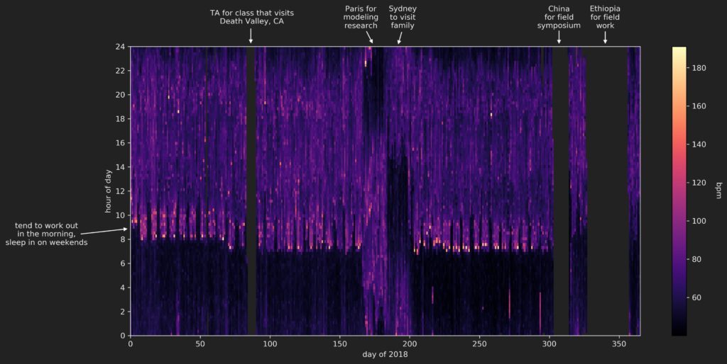
The resulting figure:
Insights
Most of the missing data can be explained by the fact that I switch to a more durable G-Shock watch (that doesn’t need charging) when I head out into the field to do research. Unfortunately, those field expeditions represent the times during the year in which I am most active (due to all the hiking we do during those trips), so that ‘high activity’ data is simply not captured.
The unusual data in the 2018 summer (around days 160-200) is due to travel to different time zones.
The data that remains does give some insight into my standard routine during 2018, without doing any further analysis:
- I did my best to work out in the morning of weekdays, right after getting up. These workouts represent the highest heart rates recorded. I did pretty poorly in the spring, better in the early-mid fall, then my schedule went all weird because of the field expeditions
- After working out, I would head to work, which involved a commute to Berkeley then a walk up hill to get to my department. We can see quite clearly a slightly elevated heart rate in the weekday mornings as I made this trip.
- The walk back down the hill to head home isn’t readily visible, at least in this particular visualization using a linear color map.
- I slept in on the weekends – probably a little later than I would have liked in retrospect…
- My total sleep didn’t change that much throughout the year, but my sleep schedule does seem to suddenly shift slightly earlier right around spring break, when the Death Valley trip took place. I don’t recall why this happened…
- I overall seemed to have a very slightly higher heart rate during the day during the spring than during the fall. This may be due to being more active during the day (I was taking/teaching more classes in the spring than in the fall), or perhaps the increased number of workouts in the fall lead to a lower resting heart rate? This question could use some more looking into…
Conclusion
Just a simple visualization can lead to some pretty informative insights! The next step, of course, is to analyze it quantitatively, and perhaps bring some more data into the mix.